
 15
15presentation
Indie Magazine Startup Pitch Deck
Shape your publishing concept with an indie magazine startup pitch deck featuring pastel gradients, bold collage layouts, and editable planning slides.
Google SlidesPowerPoint
presentation · English
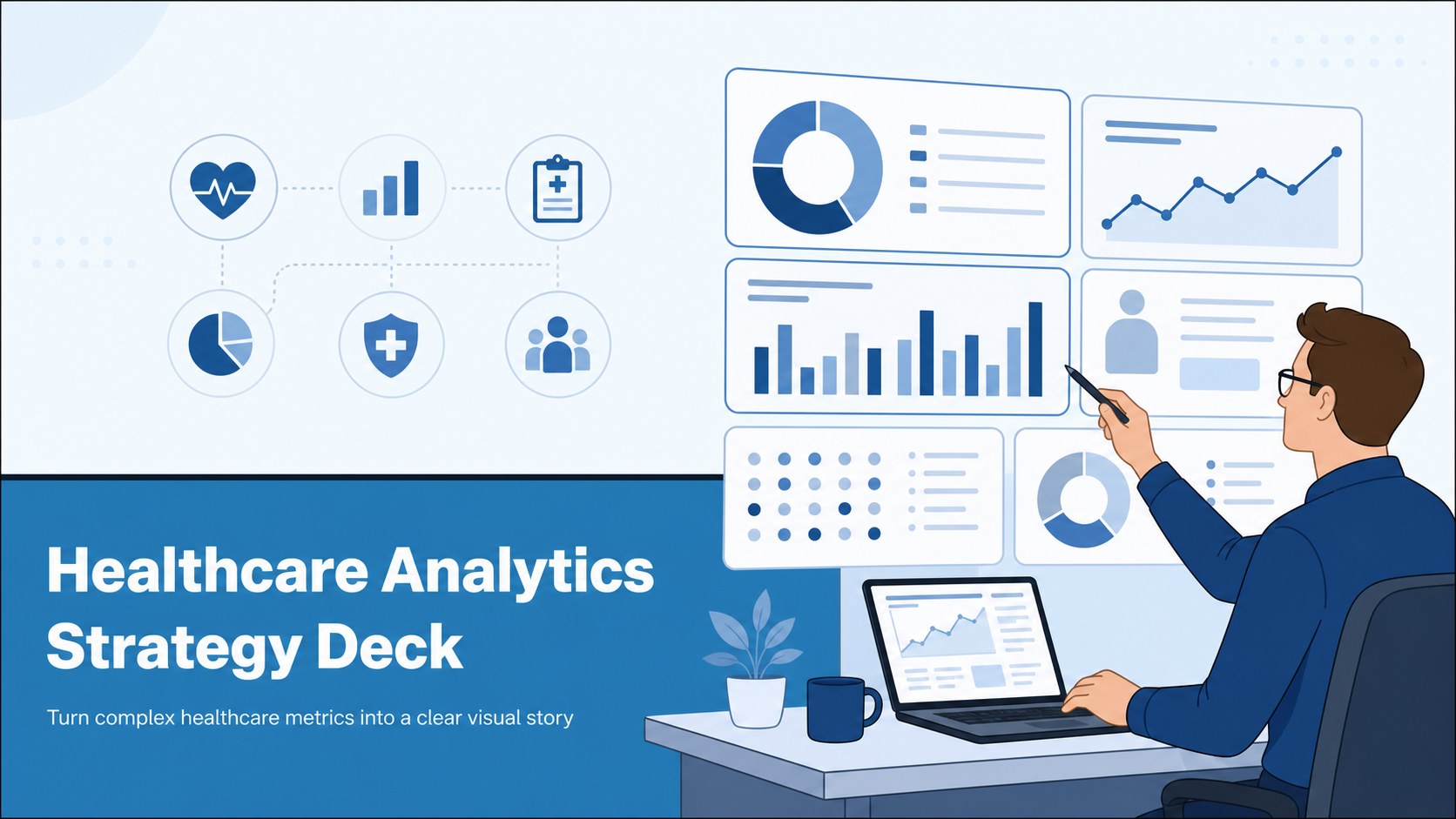
Build a clear healthcare analytics strategy deck with blue illustrated slides for dashboards, clinical insights, research findings, and data-led decisions…

Design notes
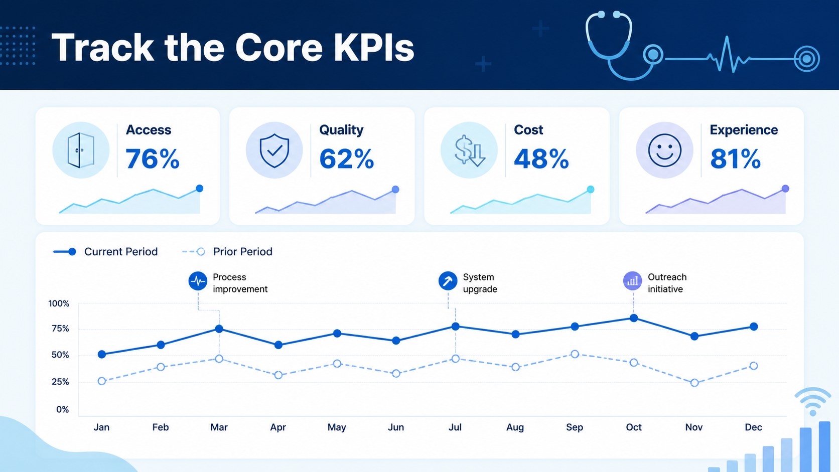
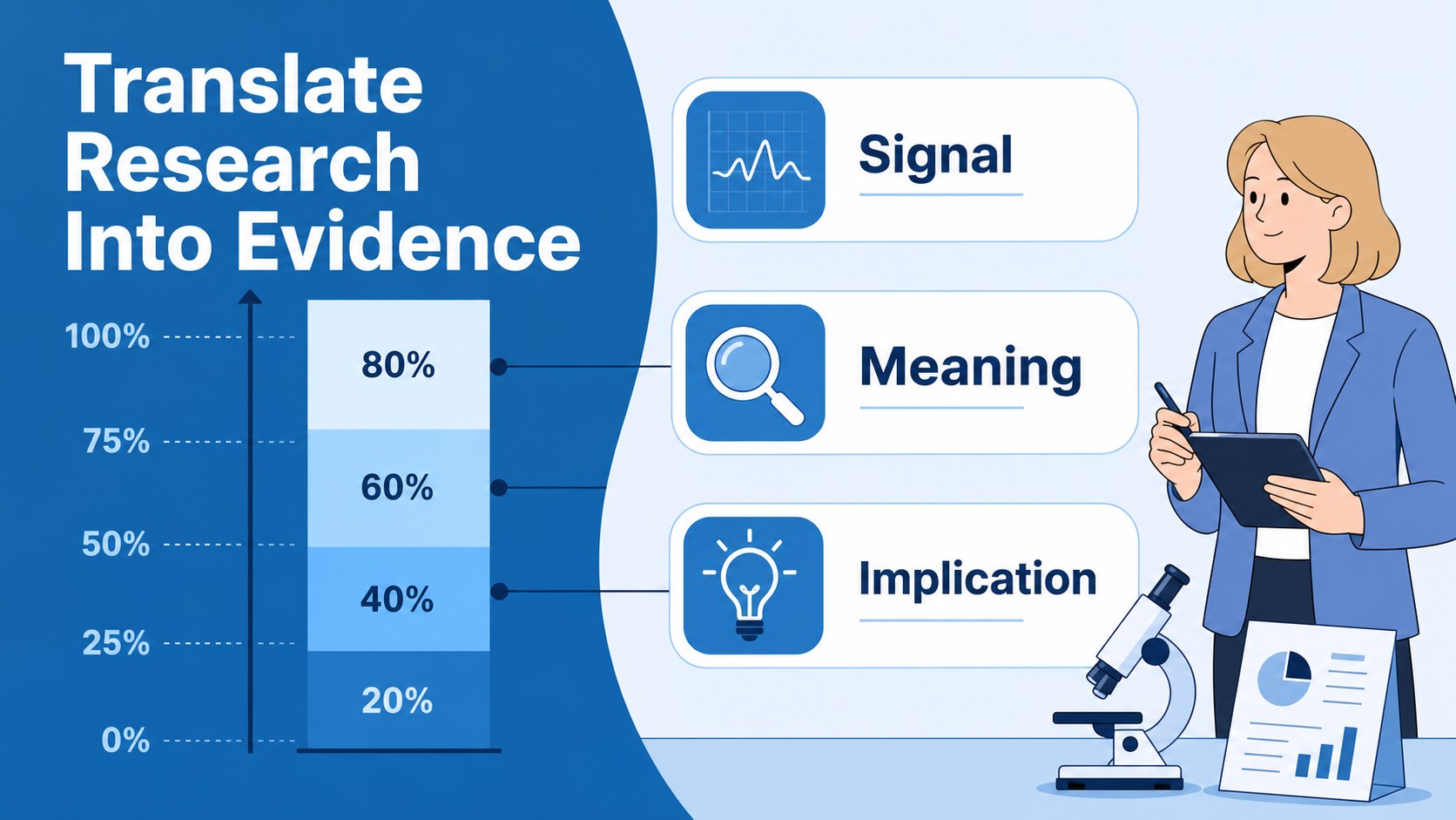
Healthcare Analytics Strategy Deck is a blue illustrated presentation system for turning complex medical data into a clear, persuasive story. Its modern Public Sans typography, simple diagrams, and approachable visual language help business professionals, healthcare teams, analysts, and researchers explain evidence without overwhelming their audience.
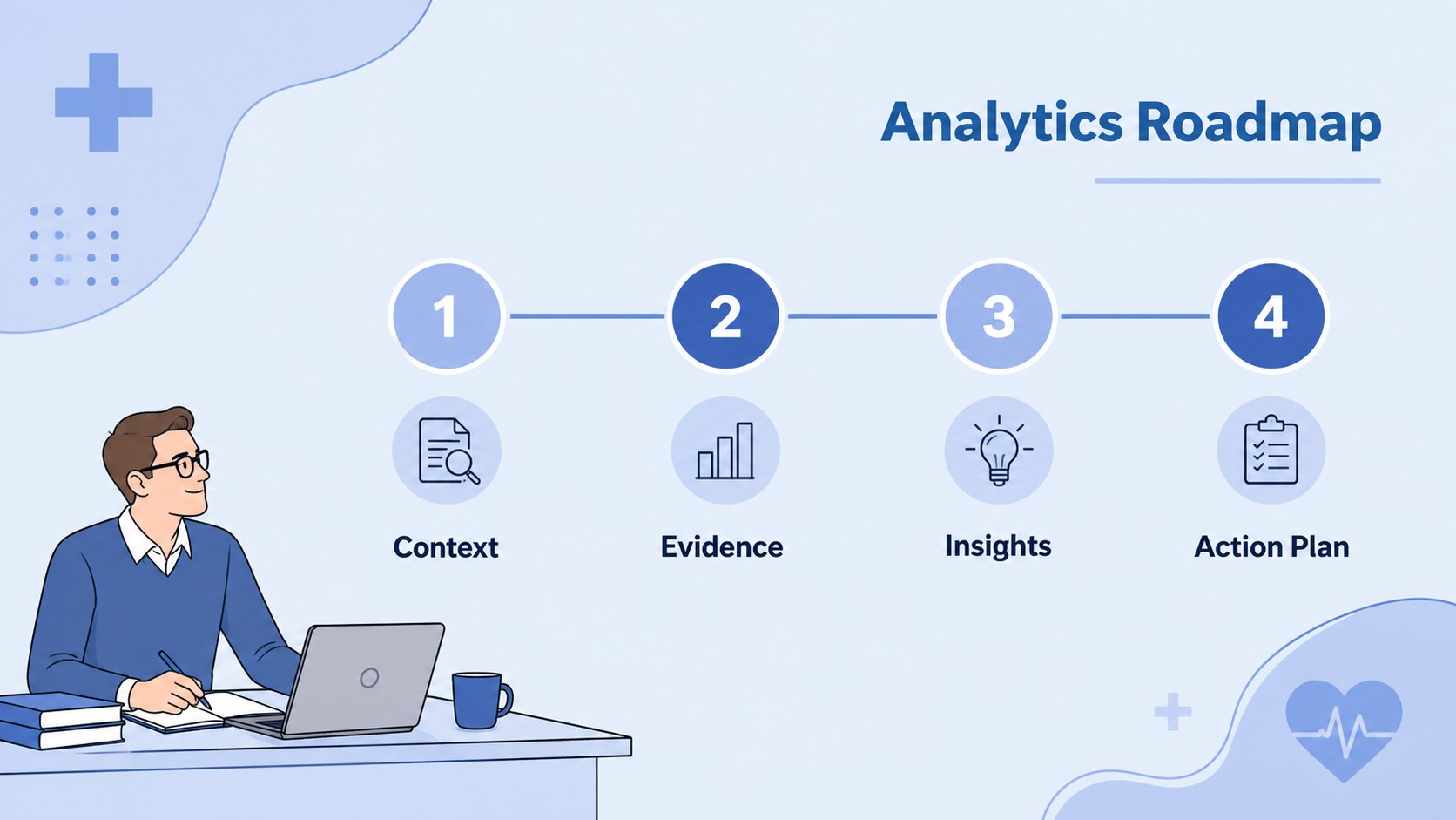
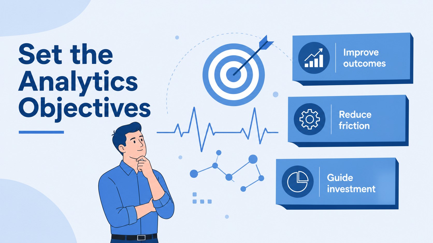
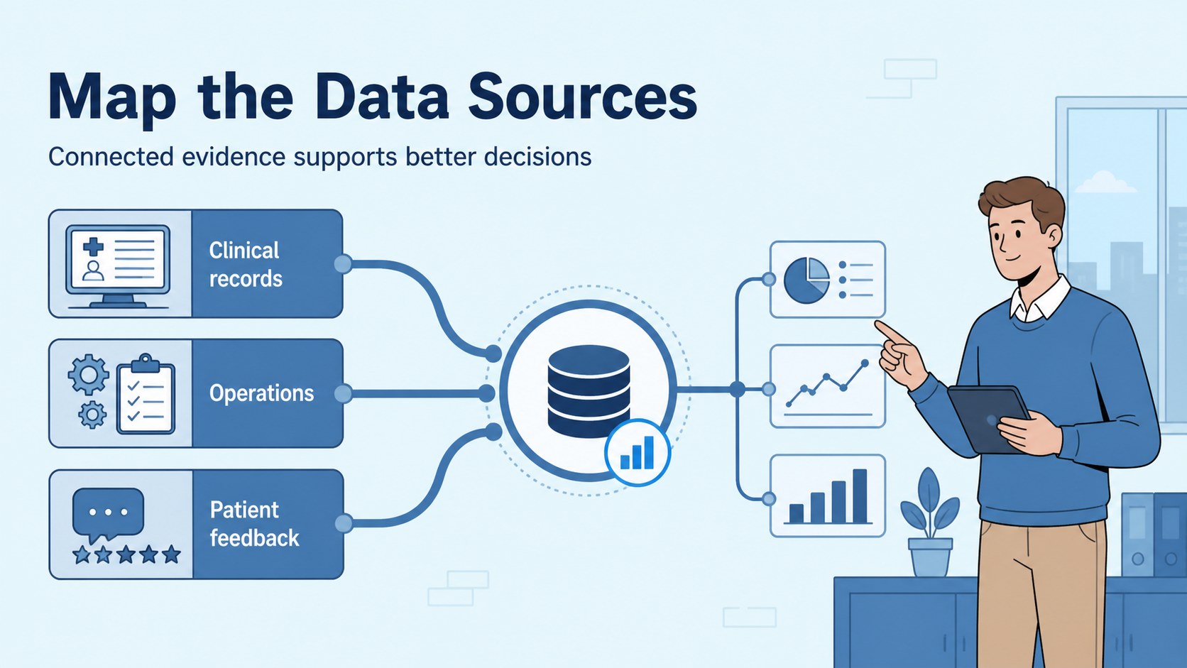
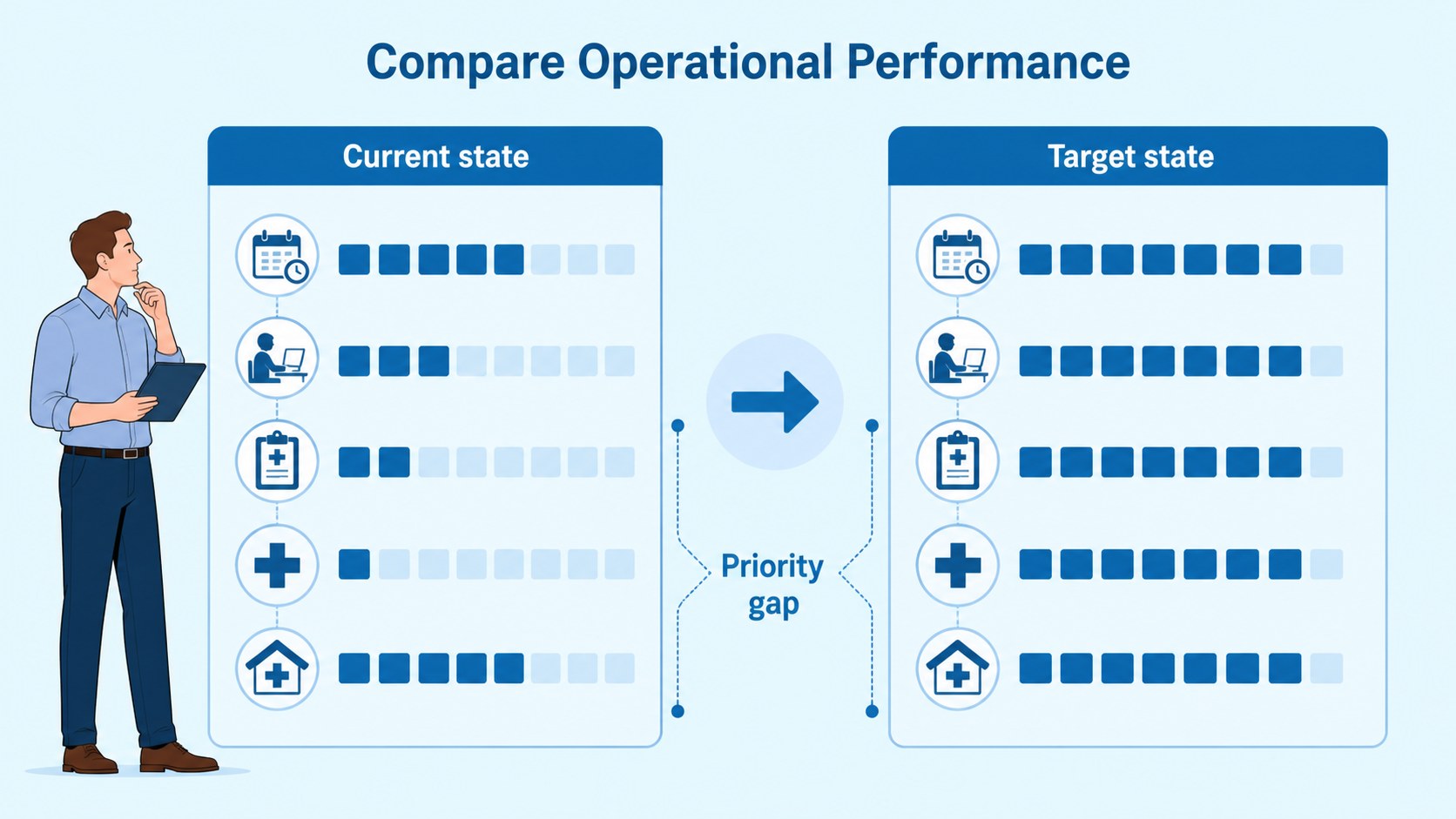
Inside, you’ll find layouts for an executive overview, analytics objectives, data sources, KPI dashboards, patient journey insights, clinical research findings, operational comparisons, risk signals, and recommended actions. Customizable charts, frames, lines, shapes, and infographic elements make it easy to build a healthcare data presentation that fits a board meeting, research review, or internal strategy session. The deck also supports a healthcare dashboard presentation with clear visual hierarchy for trends, benchmarks, and measurable outcomes.
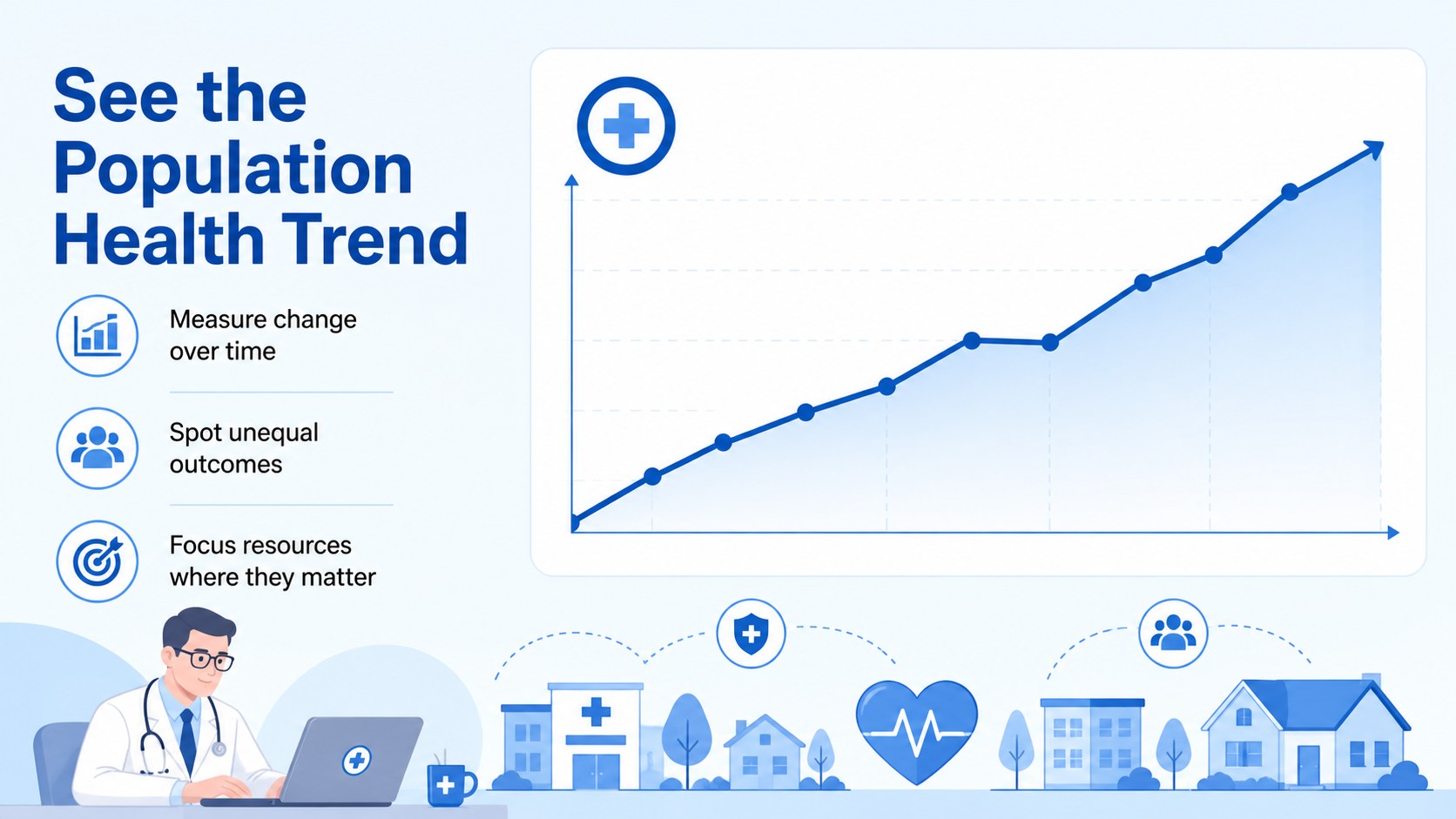
Use the template in Google Slides or PowerPoint. Every element can be edited, rearranged, recolored, and adapted to your organization’s reporting style. adds drag-and-drop graphics, animation, image libraries, speaker notes, and collaboration tools. This healthcare analytics strategy deck is especially useful for presenting population health trends, quality improvement plans, digital health initiatives, medical operations, and evidence-based recommendations.
Perfect for: hospital performance review; clinical research briefing; population health strategy; digital health investor update; medical operations meeting.
Frequently asked questions
Can I edit the healthcare analytics strategy deck in Google Slides? Yes. The presentation is designed for Google Slides and PowerPoint. Text, charts, colors, illustrations, and layout elements can be edited to match your project.
Practical details
Yes. The presentation is designed for Google Slides and PowerPoint. Text, charts, colors, illustrations, and layout elements can be edited to match your project.
Yes. It includes layouts for research findings, data sources, comparisons, trends, risks, and recommendations. Replace the sample metrics with approved study data and your preferred terminology.
Yes. The blue palette is fully customizable in each supported platform. You can add your organization’s colors while preserving the template’s illustrated visual style and readable hierarchy.
Use it for healthcare KPIs, patient journey insights, population health trends, operational metrics, quality initiatives, and digital health results. Keep each slide focused on one conclusion or decision.
Keep exploring
15Shape your publishing concept with an indie magazine startup pitch deck featuring pastel gradients, bold collage layouts, and editable planning slides.
 16
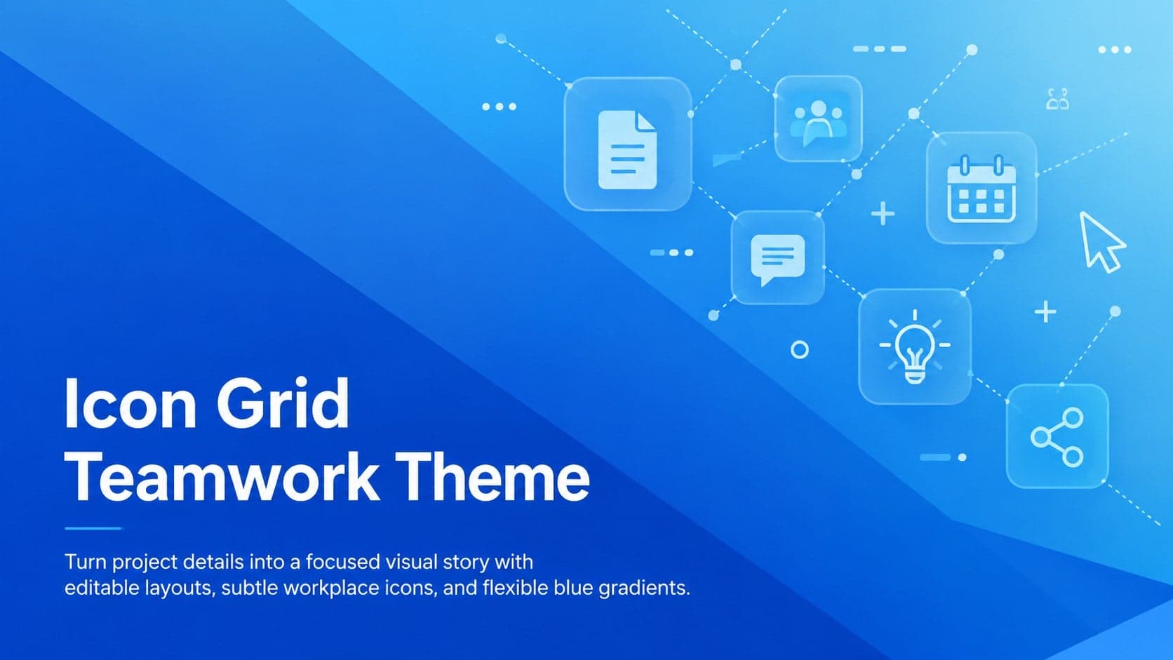
16Build clear project stories with the Icon Grid Teamwork Theme, a flexible blue illustrated deck for proposals, strategy updates, and team meetings.
 3
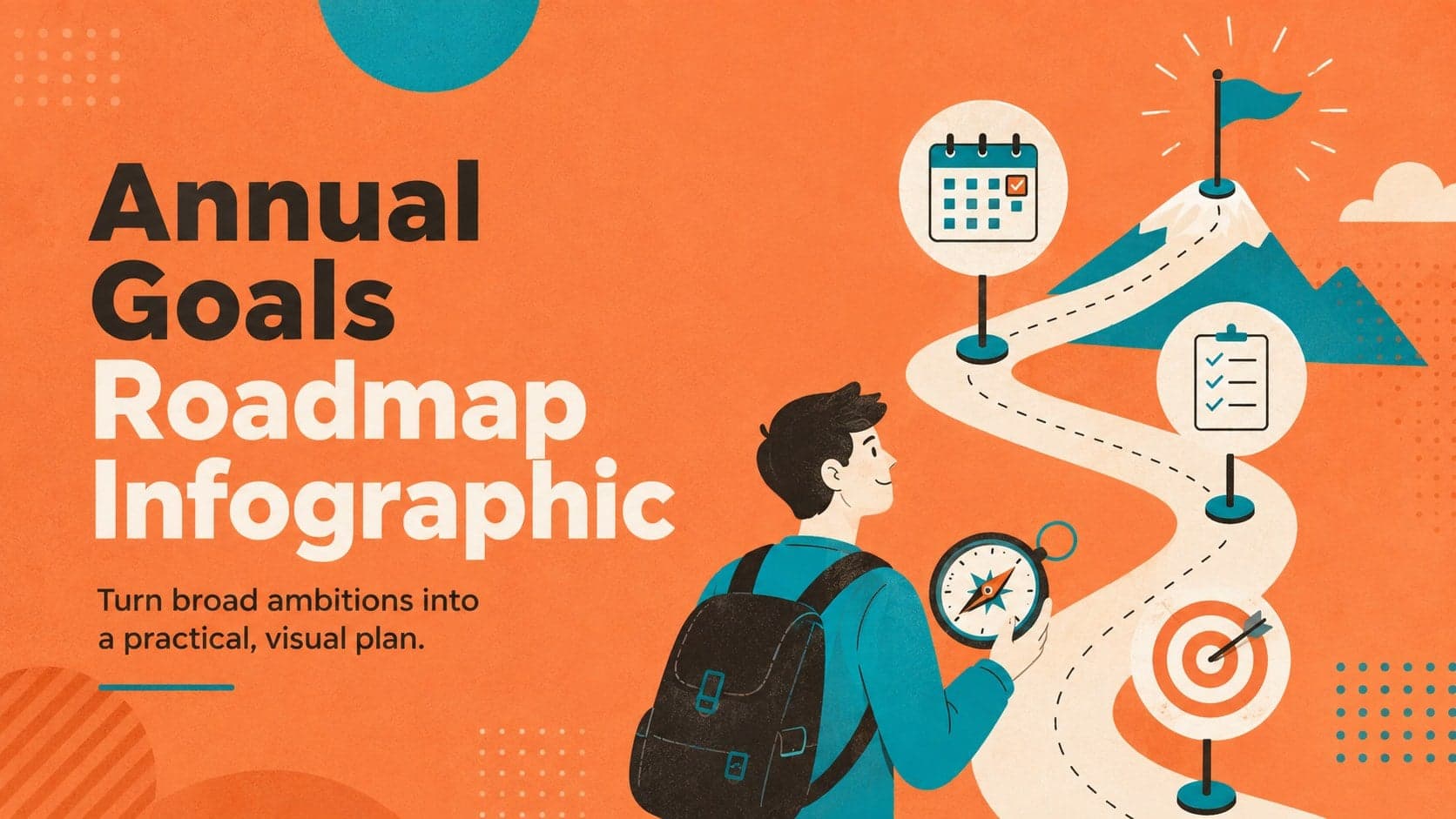
3Turn priorities into an actionable plan with an annual goals roadmap infographic, featuring editable orange and teal layouts for PowerPoint and Google Slides.
 15
15Create an Annual Achievement Report Presentation with colorful geometric layouts for milestones, results, lessons, and priorities in PowerPoint or Google Slides.
 15
15Turn results into a focused annual performance evaluation report with dark 3D slides for KPIs, achievements, feedback, and next-step goals for teams.
 15
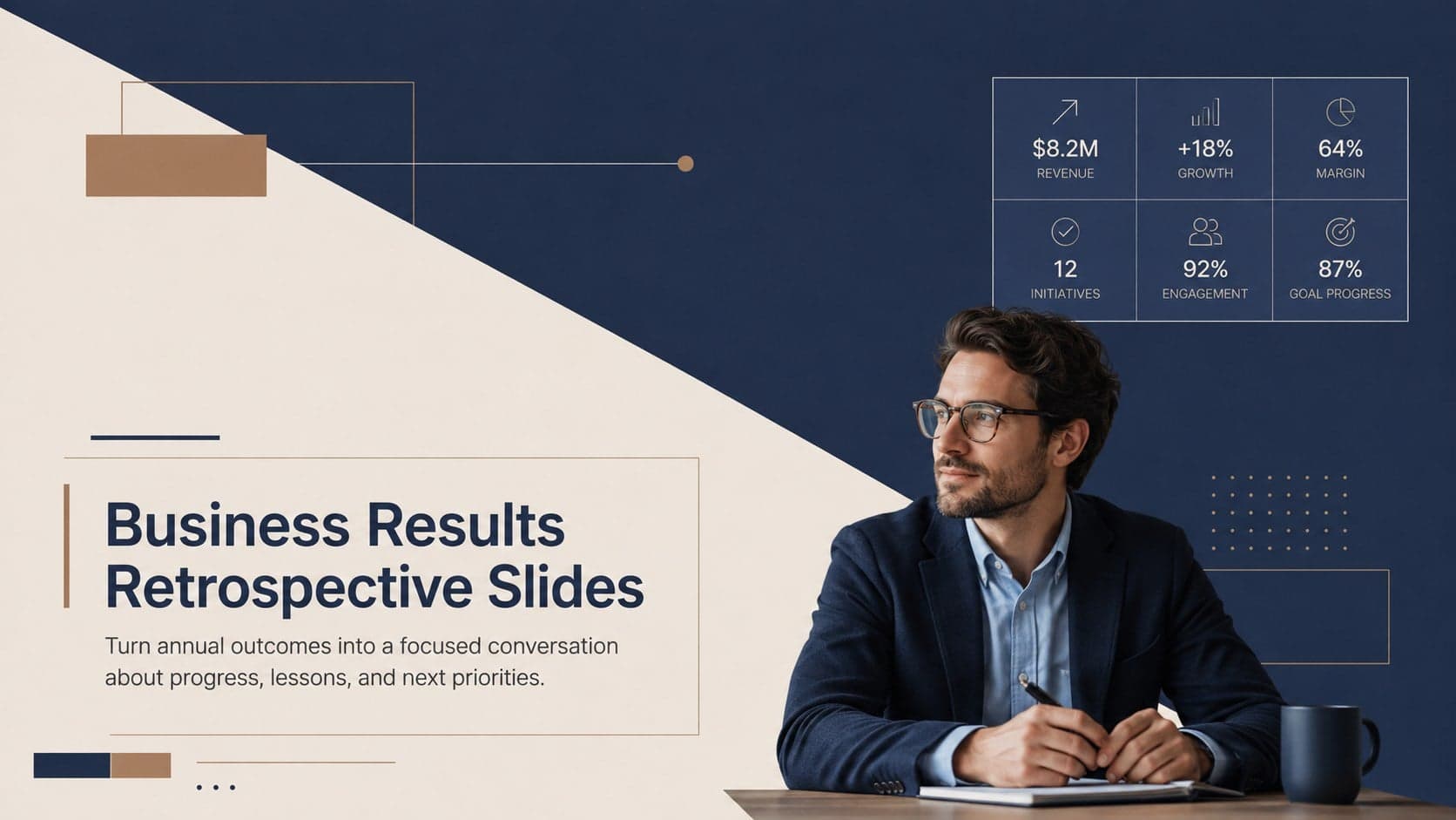
15Guide a focused annual recap with Business Results Retrospective Slides, a muted brown-and-blue template for PowerPoint and Google Slides.
 6
6Turn complex plans into clear visual stories with Color-Coded Workflow Path Slides, an editable set for project updates, roadmaps, and team briefings.
 6
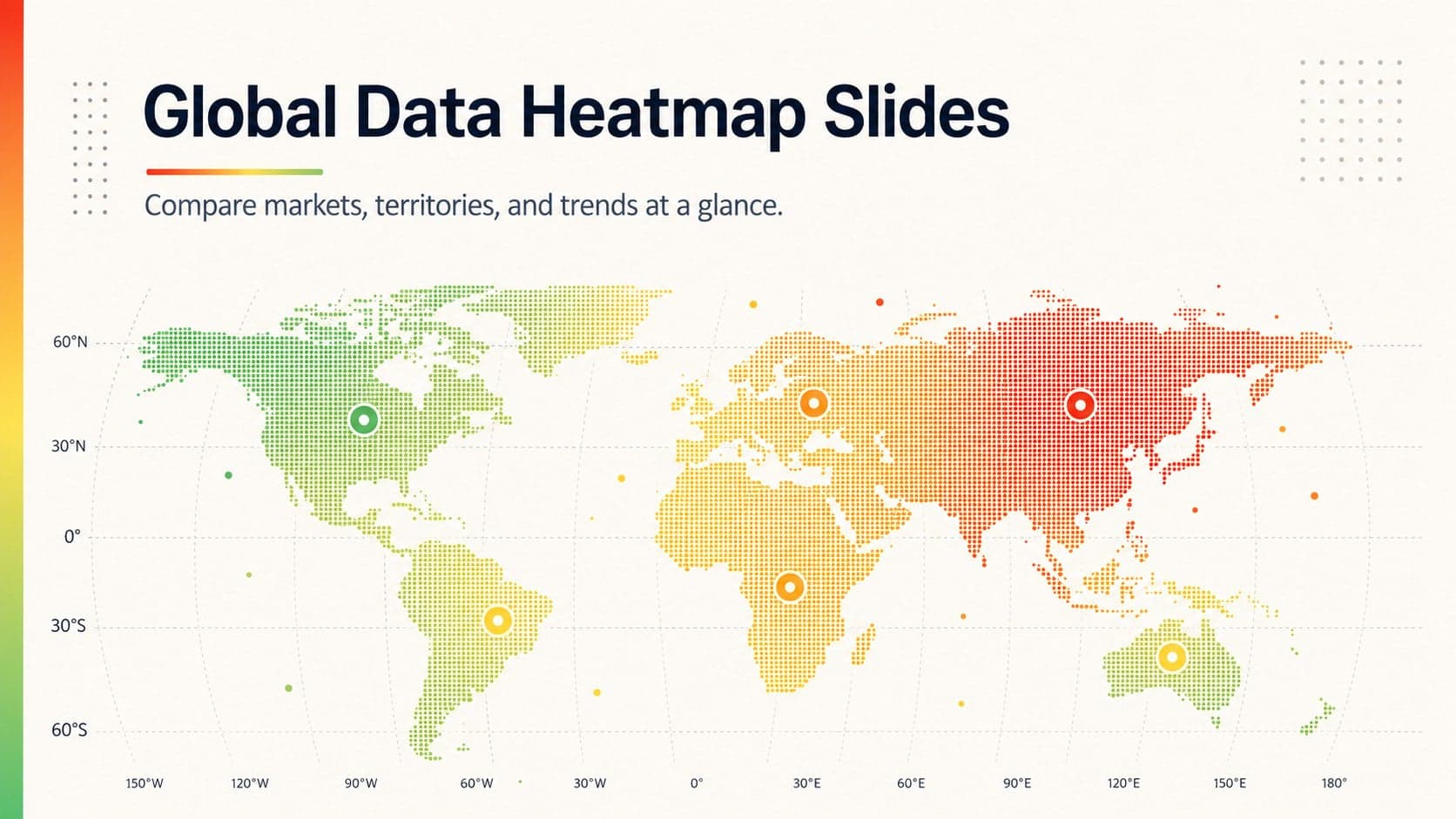
6Compare regional performance at a glance with Global Data Heatmap Slides, a clean multicolor deck designed for editable PowerPoint and Google Slides.