
 15
15presentation
Indie Magazine Startup Pitch Deck
Shape your publishing concept with an indie magazine startup pitch deck featuring pastel gradients, bold collage layouts, and editable planning slides.
Google SlidesPowerPoint
presentation · English
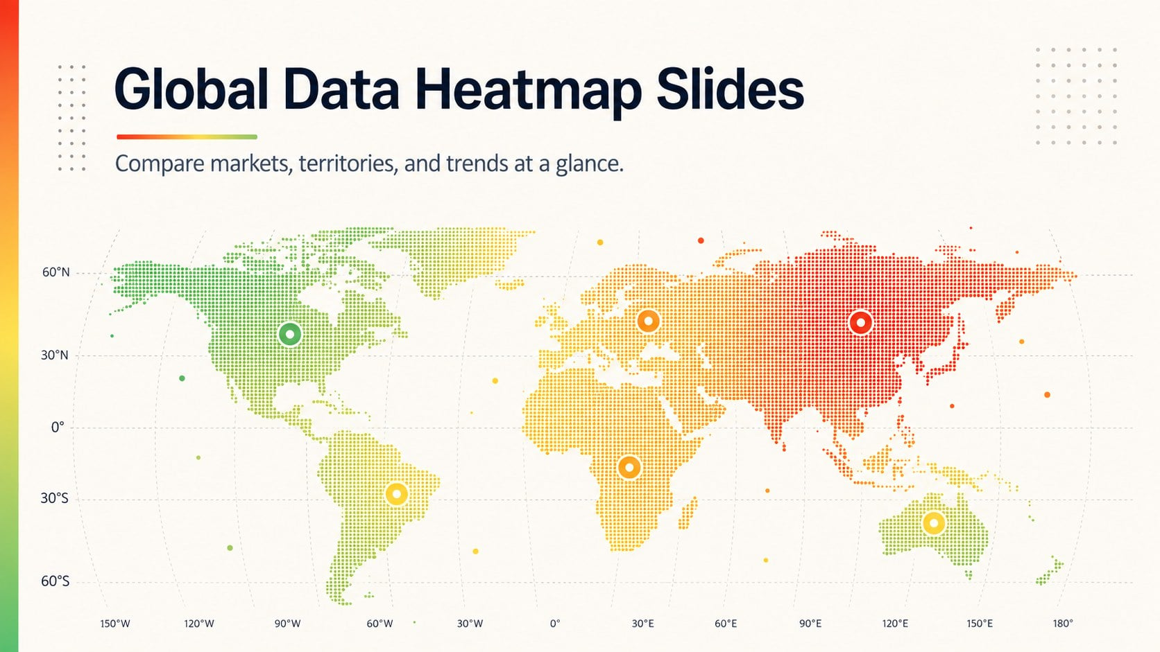
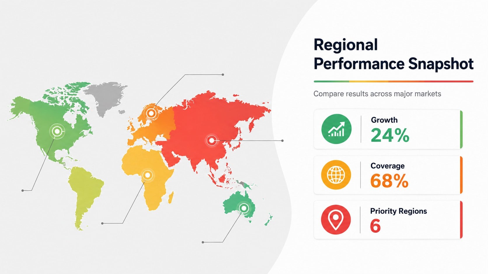
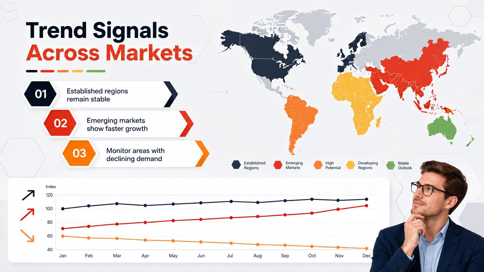
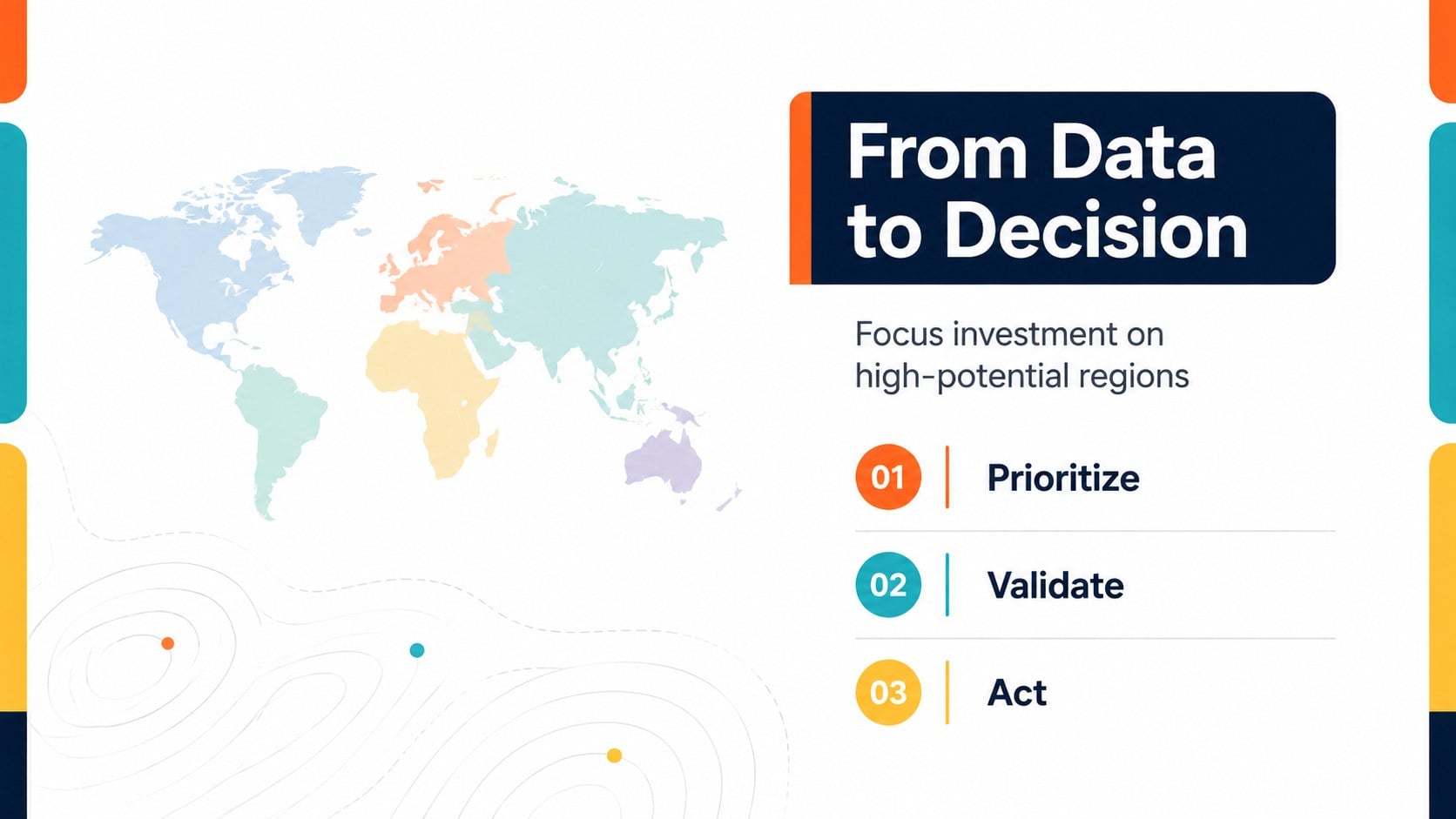
Compare regional performance at a glance with Global Data Heatmap Slides, a clean multicolor deck designed for editable PowerPoint and Google Slides.
Design notes
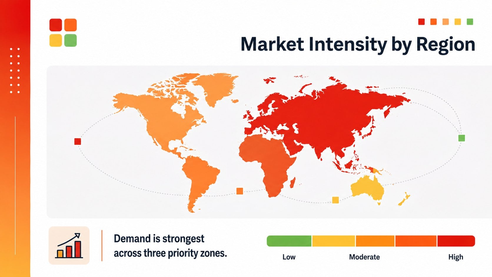
Global Data Heatmap Slides help teams explain location-based metrics without overwhelming their audience. The clean, multicolor design turns geographic patterns into an accessible visual narrative for reports, strategy meetings, and research presentations. Use this editable world heat map presentation to compare performance, identify clusters, and show where opportunities or risks are concentrated.
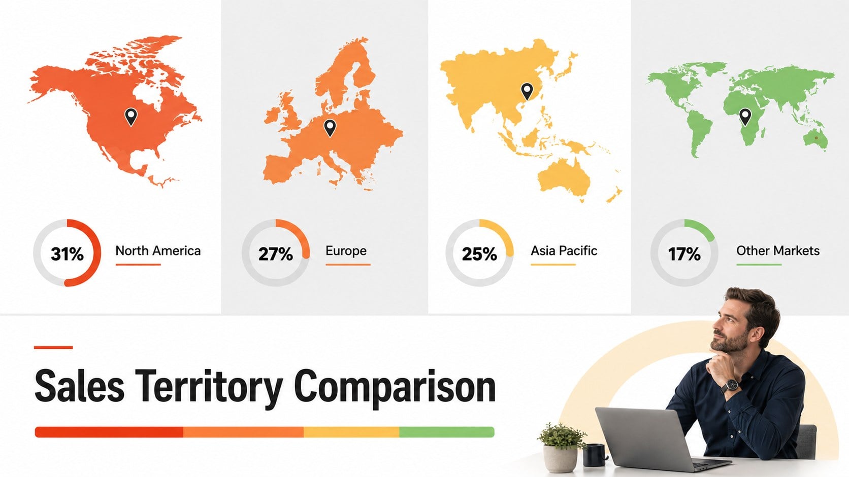
The deck includes six 16:9 layouts with global maps, color-coded regions, intensity legends, comparison panels, summary statistics, and space for concise findings. Each layout can be adapted with your own country values, labels, brand colors, and supporting notes. The regional performance map slides are designed to keep dense information readable while giving presenters enough flexibility to highlight sales, population, market demand, operational coverage, or survey results.
This geographic data visualization deck is suitable for analysts, consultants, marketers, educators, researchers, and international business teams. It works especially well for quarterly reviews, expansion planning, sales territory analysis, public policy briefings, and classroom discussions about global trends. Edit the slides in PowerPoint or Google Slides, replace the sample figures with your own data, and adjust the color scale to match the story your numbers need to tell.
Perfect for: global market analysis; regional sales review; territory performance report; international expansion planning; geographic research briefing.
Frequently asked questions
Can I edit the map colors and regional labels? Yes. You can change the color scale, labels, values, legends, and supporting text to reflect your own geographic data. Individual elements can also be resized or repositioned.
Practical details
Yes. You can change the color scale, labels, values, legends, and supporting text to reflect your own geographic data. Individual elements can also be resized or repositioned.
The template is designed for PowerPoint and Google Slides. Both platforms support editing the text, shapes, colors, and map annotations used throughout the deck.
Yes. Replace the sample palette with your brand colors, apply preferred fonts, and add your own logo after downloading the template. Keep strong contrast between map regions so the data remains easy to interpret.
The layouts can present sales, population, growth, demand, risk, survey results, service coverage, or operational performance by region. Use a consistent scale and include a clear legend so viewers can compare locations accurately.
Keep exploring
15Shape your publishing concept with an indie magazine startup pitch deck featuring pastel gradients, bold collage layouts, and editable planning slides.
 16
16Build clear project stories with the Icon Grid Teamwork Theme, a flexible blue illustrated deck for proposals, strategy updates, and team meetings.
 3
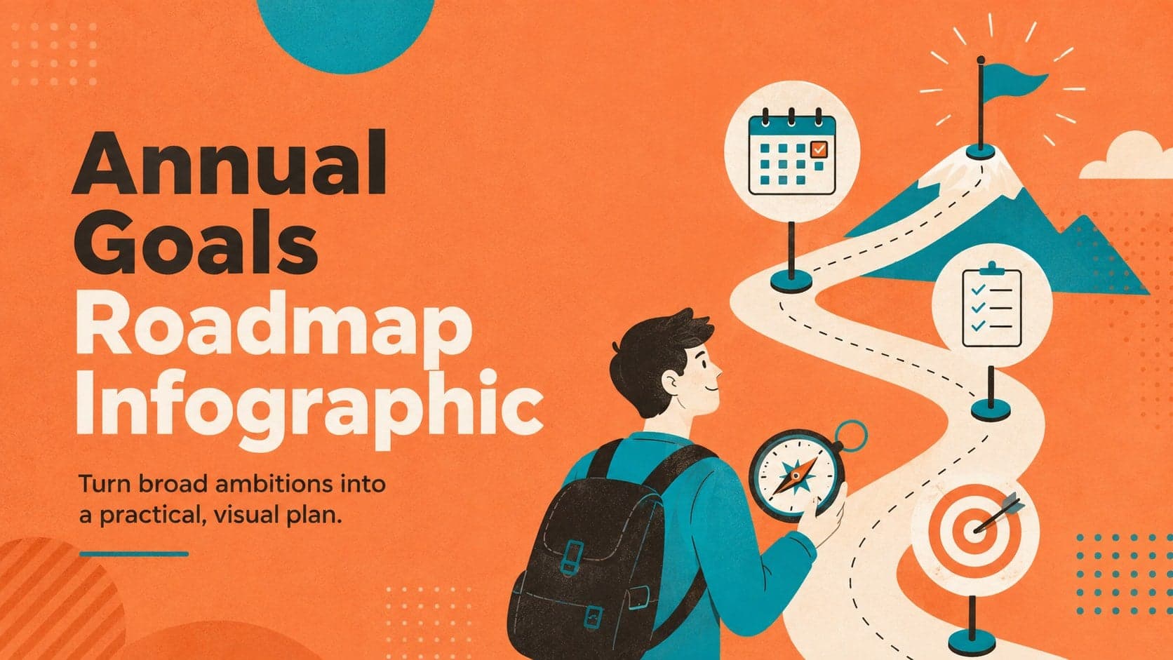
3Turn priorities into an actionable plan with an annual goals roadmap infographic, featuring editable orange and teal layouts for PowerPoint and Google Slides.
 15
15Create an Annual Achievement Report Presentation with colorful geometric layouts for milestones, results, lessons, and priorities in PowerPoint or Google Slides.
 15
15Turn results into a focused annual performance evaluation report with dark 3D slides for KPIs, achievements, feedback, and next-step goals for teams.
 15
15Guide a focused annual recap with Business Results Retrospective Slides, a muted brown-and-blue template for PowerPoint and Google Slides.
 6
6Turn complex plans into clear visual stories with Color-Coded Workflow Path Slides, an editable set for project updates, roadmaps, and team briefings.
 15
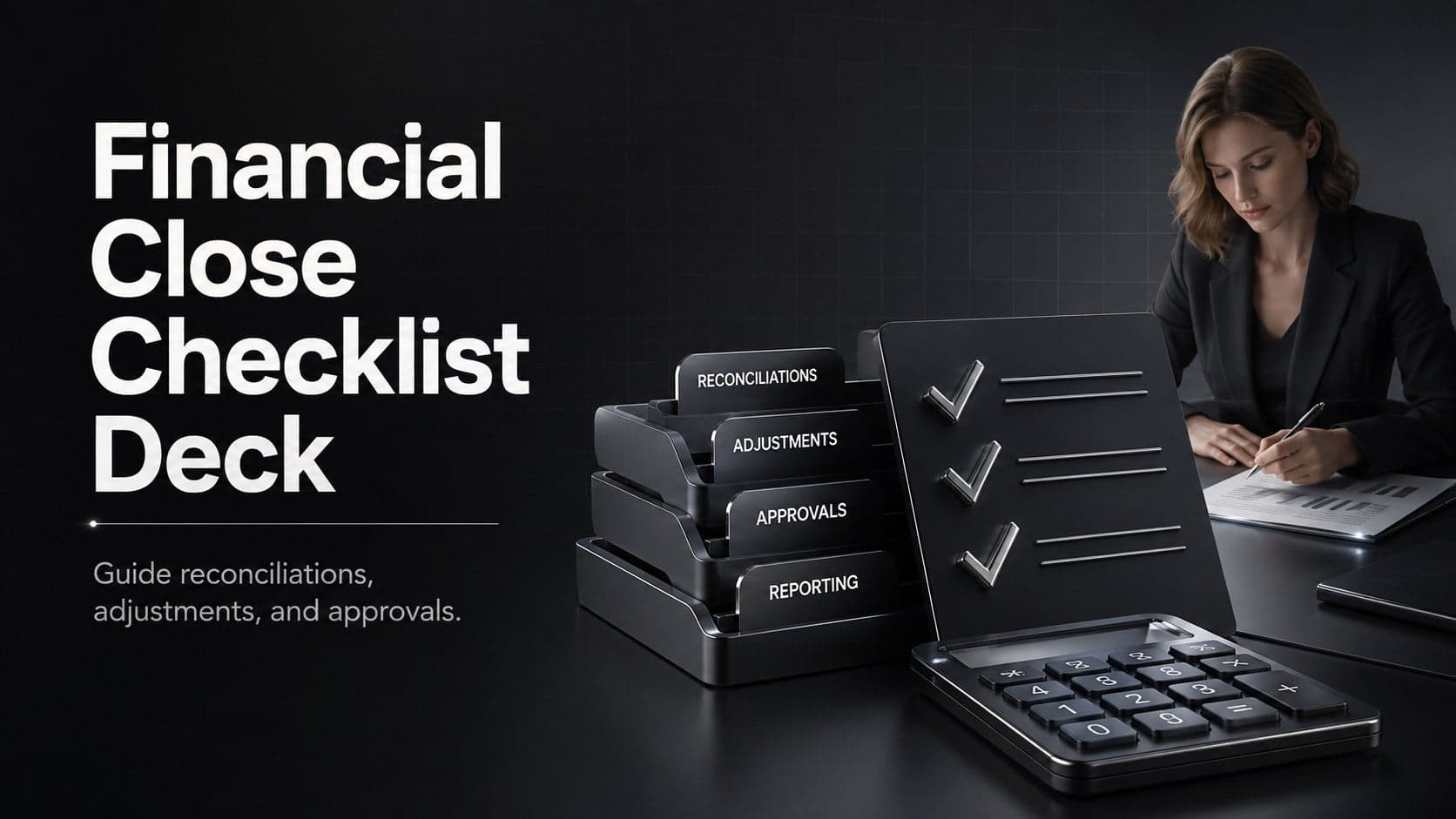
15Run a cleaner reporting cycle with this financial close checklist deck for PowerPoint and Google Slides, built for reconciliations, reviews, and sign-off.