
 15
15presentation
Indie Magazine Startup Pitch Deck
Shape your publishing concept with an indie magazine startup pitch deck featuring pastel gradients, bold collage layouts, and editable planning slides.
Google SlidesPowerPoint
presentation · English
Build clearer financial conversations with expense mapping dashboard slides for budgets, cost structures, and business reviews in PowerPoint or Google Slides.

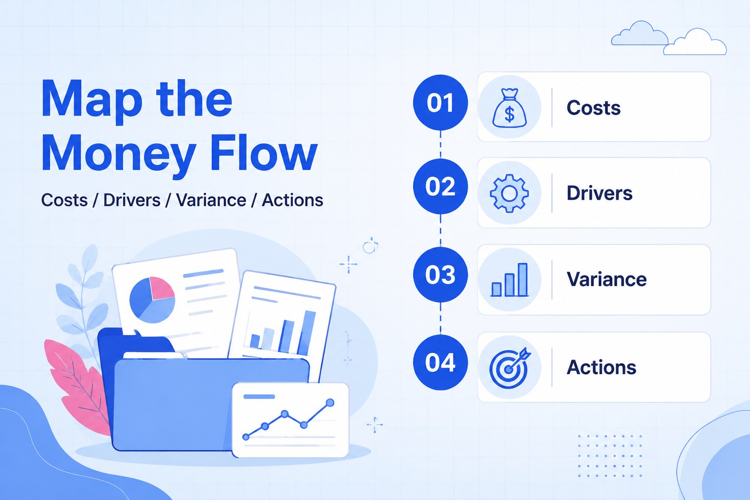
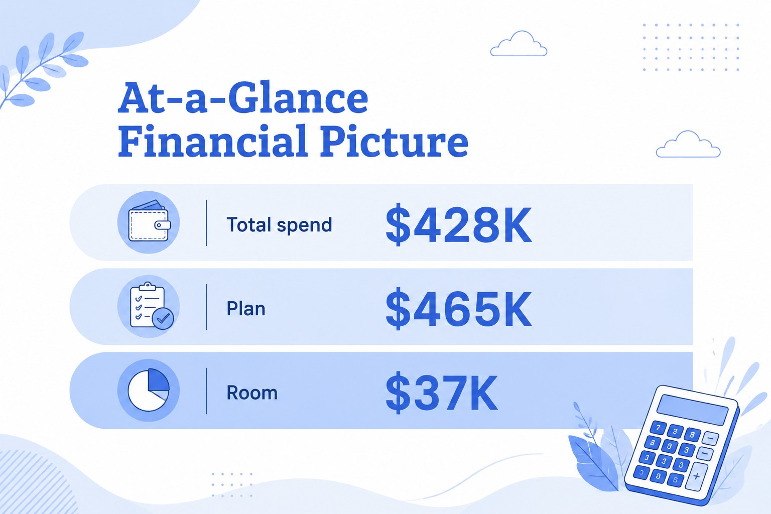
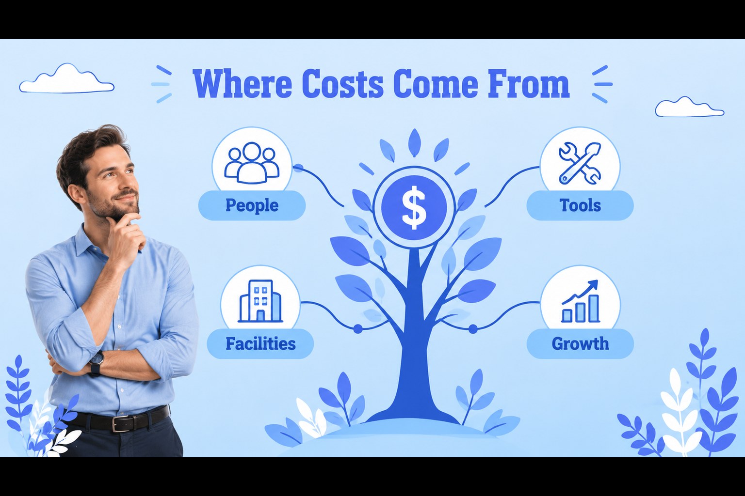
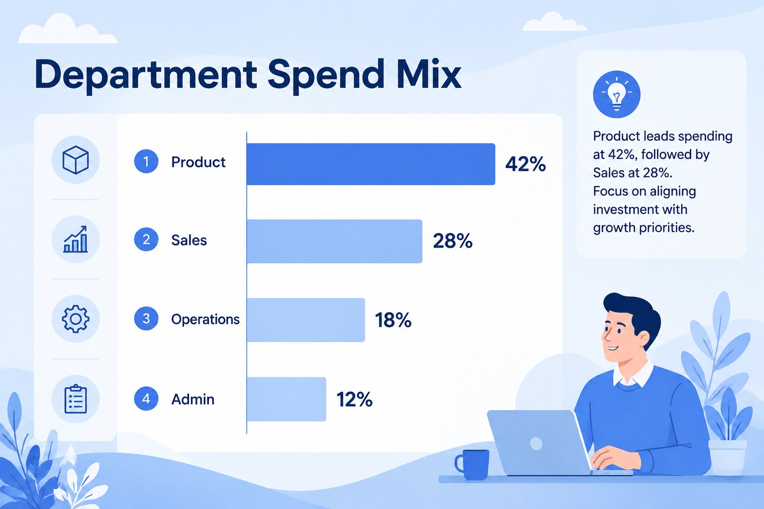
Design notes
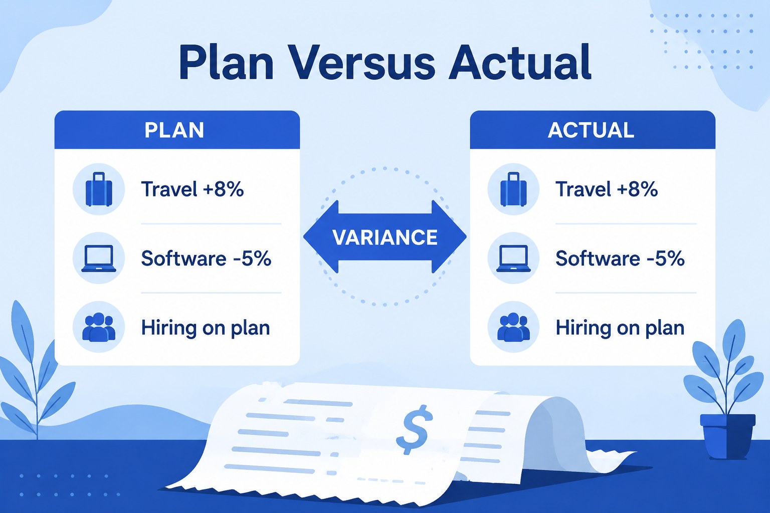
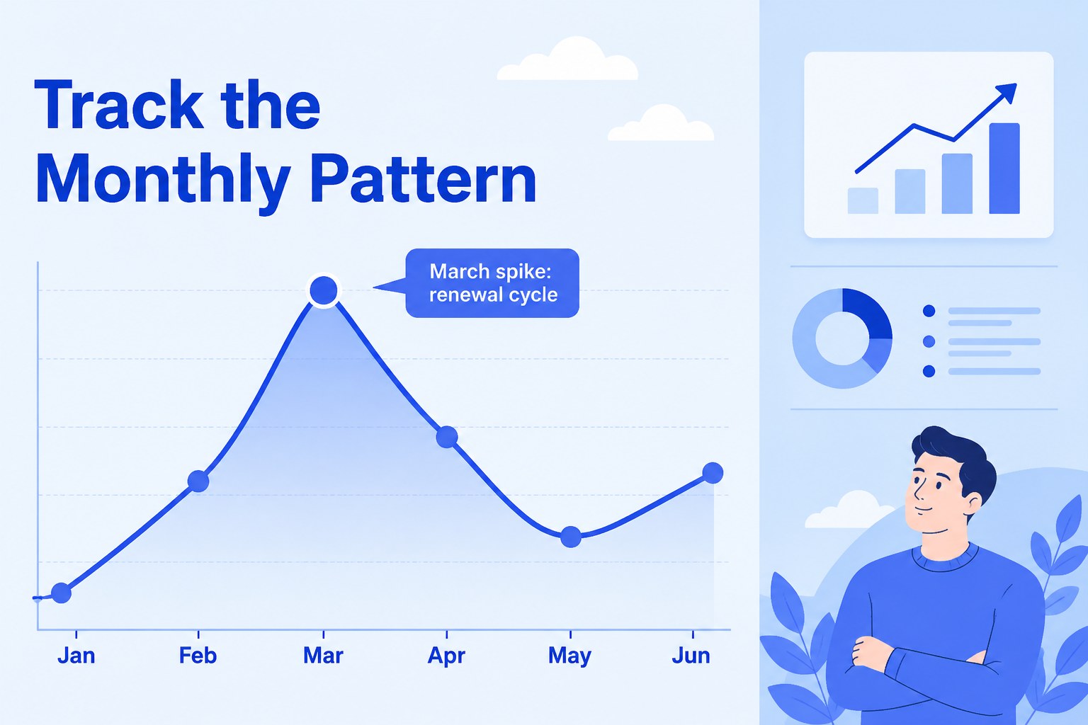
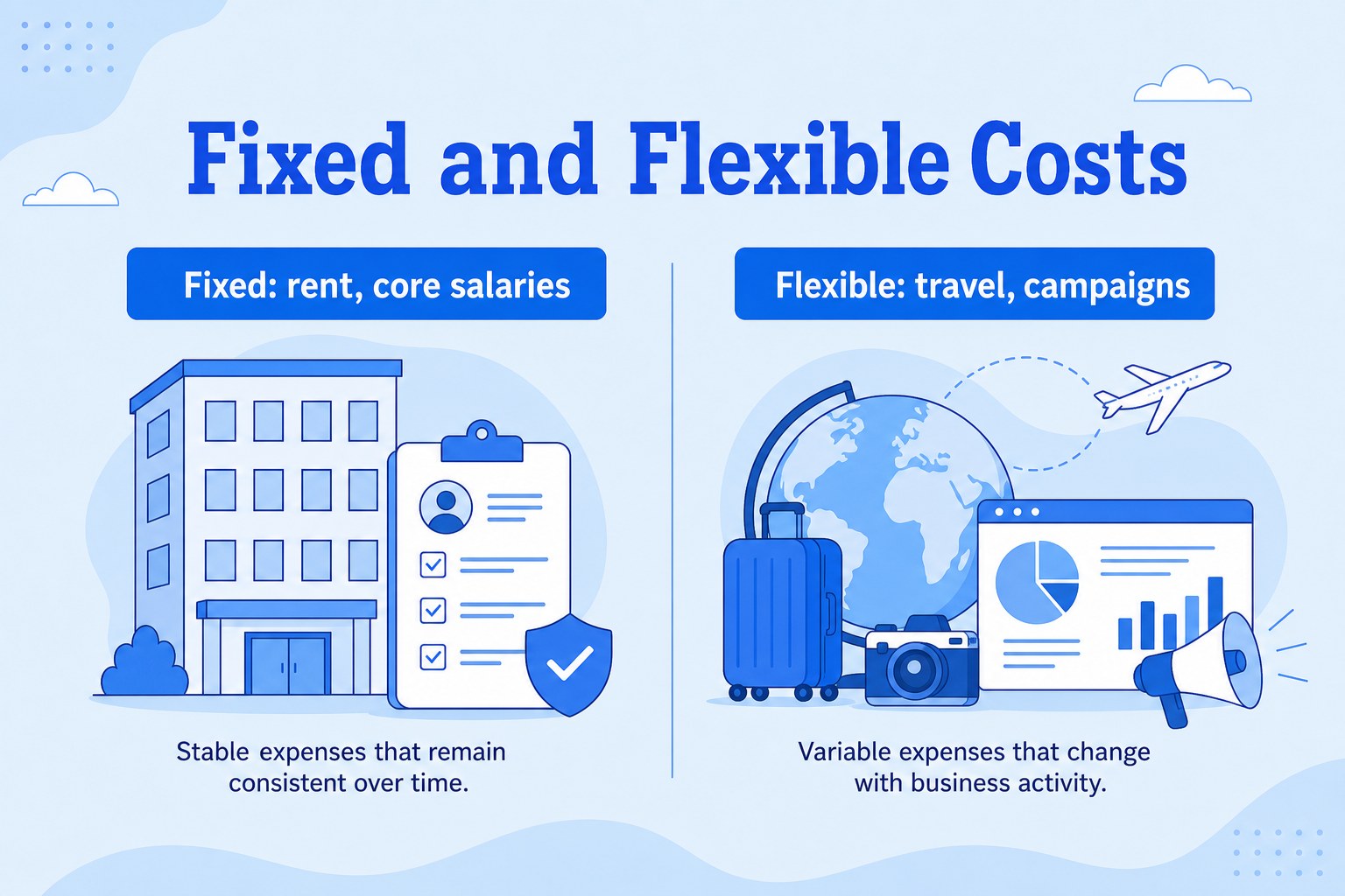
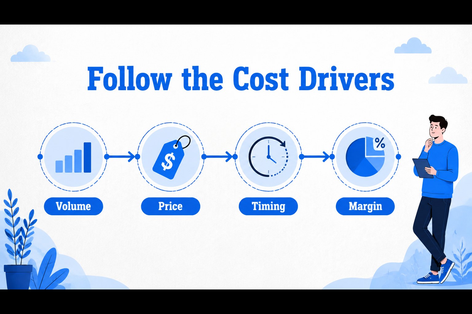
Expense mapping dashboard slides help teams turn complex spending data into a clear business narrative. Use the deck to organize operating costs, compare budget lines, explain cost drivers, and highlight where resources are moving. Its illustrated blue visual system gives financial information a polished, approachable feel without making the presentation look overly formal.
Inside, you’ll find 15 editable infographic layouts with chart areas, comparison panels, process diagrams, metric callouts, category maps, and summary views. Build a cost structure overview, show monthly variance, group expenses by department, or create a concise finance dashboard for leadership. The layouts are designed for PowerPoint and Google Slides, making them practical for collaborative reporting and recurring business reviews.
This template suits finance managers, business analysts, startup operators, consultants, department heads, and advisory teams. It works well for a startup burn-rate review, an annual budgeting workshop, a procurement update, or a management presentation about operational efficiency. Replace the sample figures, adjust the labels, and adapt the blue palette to match your organization while keeping the visual hierarchy intact.
Perfect for: startup burn-rate review; annual budgeting workshop; procurement cost update; department expense report; operational efficiency briefing.
Frequently asked questions
Can I edit these slides in PowerPoint? Yes. The layouts are designed for PowerPoint editing, so you can replace text, figures, charts, and shapes. Use your normal PowerPoint tools to apply brand fonts and update the presentation colors.
Practical details
Yes. The layouts are designed for PowerPoint editing, so you can replace text, figures, charts, and shapes. Use your normal PowerPoint tools to apply brand fonts and update the presentation colors.
Yes, you can open and edit the deck in Google Slides. Check charts, fonts, and spacing after import because some elements may need small adjustments between presentation applications.
The layouts support expense categories, budget-versus-actual comparisons, department spending, recurring costs, procurement data, and operating metrics. Replace the sample labels and numbers with figures from your own reporting system.
You can change the colors, typography, illustrations, icons, and data while retaining the original visual structure. Keep strong contrast between labels, figures, and chart elements so the dashboard remains easy to scan.
Keep exploring
15Shape your publishing concept with an indie magazine startup pitch deck featuring pastel gradients, bold collage layouts, and editable planning slides.
 16
16Build clear project stories with the Icon Grid Teamwork Theme, a flexible blue illustrated deck for proposals, strategy updates, and team meetings.
 3
3Turn priorities into an actionable plan with an annual goals roadmap infographic, featuring editable orange and teal layouts for PowerPoint and Google Slides.
 15
15Create an Annual Achievement Report Presentation with colorful geometric layouts for milestones, results, lessons, and priorities in PowerPoint or Google Slides.
 15
15Turn results into a focused annual performance evaluation report with dark 3D slides for KPIs, achievements, feedback, and next-step goals for teams.
 15
15Guide a focused annual recap with Business Results Retrospective Slides, a muted brown-and-blue template for PowerPoint and Google Slides.
 6
6Turn complex plans into clear visual stories with Color-Coded Workflow Path Slides, an editable set for project updates, roadmaps, and team briefings.
 6
6Compare regional performance at a glance with Global Data Heatmap Slides, a clean multicolor deck designed for editable PowerPoint and Google Slides.